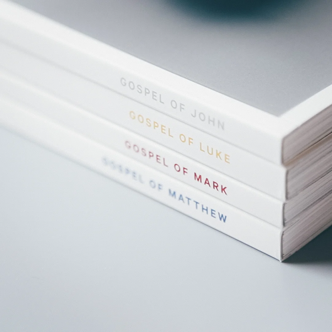
Alabaster
November 2016 – April 2021
Company: Alabaster Co.
Creative direction: Bryan Chung
The 4 Gospels : print and editorial
Alabaster is a publication of the 4 gospels from the Holy Bible in which visual imagery and thoughtful design is integrated within the text to create a new and beautiful bible reading experience. I was hired by the founders of Alabaster bible as the lead designer to develop their initial branding and design the layouts, typography, and cover of the 4 books.
The main goal for the design is to create layouts that are simple and balanced so that the readers can have a richer reading experience as they take in both text and imagery for each passage.
The project was launched on Kickstarter and is now also available on Amazon. To learn more about Alabaster, visit their website: Alabaster Co.
The Book of Psalms
After launching Alabaster: The Four Gospels, Alabaster Co. expanded its vision with the Book of Psalms, a poetic collection capturing humanity's desire to know God.
The key design challenge was typography. Unlike the Gospels, Psalms features shorter lines, frequent breaks, and verse numbers, which couldn’t be adjusted without altering the meaning. Justified text didn’t suit the content, so I opted for ragged-right typesetting, removed indents, separated verse numbers from the body copy, and preserved original line breaks. This solution maintained the integrity of the text while enhancing readability and aligning with Alabaster’s minimalist aesthetic.


